5 Major Mobile App UI Design Mistakes to Avoid in 2023
Rajat Chauhan is a Manager of Digital Marketing at Ace Infoway Pvt. Ltd - A leading web and mobile development company with offices in LA and India. He is a full-stack marketer with a deadly focus on better writing and disciplined creativity while implementing growth strategies for organizational goals.
As per Statista, an estimated 36.8 billion downloads of apps from the App Store and Play Store were made in the first quarter of 2022. With so many apps being downloaded, it’s no surprise that over 70% of users are anticipated to churn across all categories in the app stores within 90 days.
If a navigation design or any part of the app is unappealing, users will choose to install a new one instead of continuing to use the flawed app. When a customer deletes an app, he or she loses nothing other than possibly a few dollars. However, on the other hand, you’ll lose a valuable business idea!
So, avoiding some common navigation design mistakes will help businesses create apps with better user experience and help your business cross the 90 days threshold efficiently.
Let’s discuss 5 common mobile app navigation design mistakes that you should avoid and take preventative measures to enhance your app:
## 5 Common Mobile App Navigation Design Mistakes
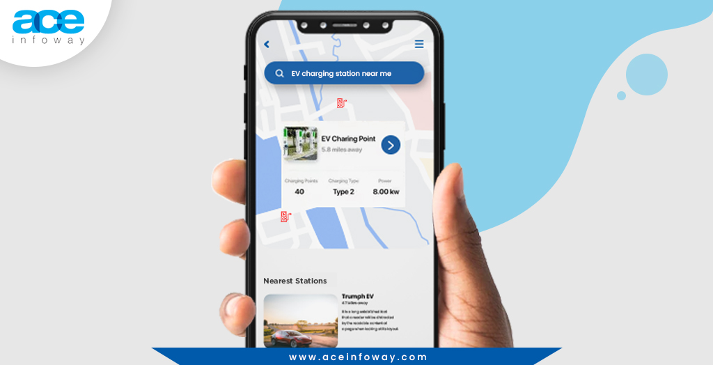
1) Your Navigation Menu Has Too Many Options
The primary mobile navigation menu of the app can be accessed via the navigation menu. Therefore, if the opportunities in the primary navigation menu are too many, users can get confused and quit the app without taking any action.
Take an example of a restaurant menu, if you have so many dish options you get confused & overwhelmed and it is often hard to decide on the best dish. It’s the same with apps. Users will just leave an app if it has an extensive list of items that they find difficult to quickly comprehend.
 💡Practical Recommendation:
It is better to keep the primary navigation menu precise and short. So, users can quickly scan the entire menu without taking too much time. The clearer your UX navigation for the menu is to the users, the better the designers have done the job.
💡Practical Recommendation:
It is better to keep the primary navigation menu precise and short. So, users can quickly scan the entire menu without taking too much time. The clearer your UX navigation for the menu is to the users, the better the designers have done the job.
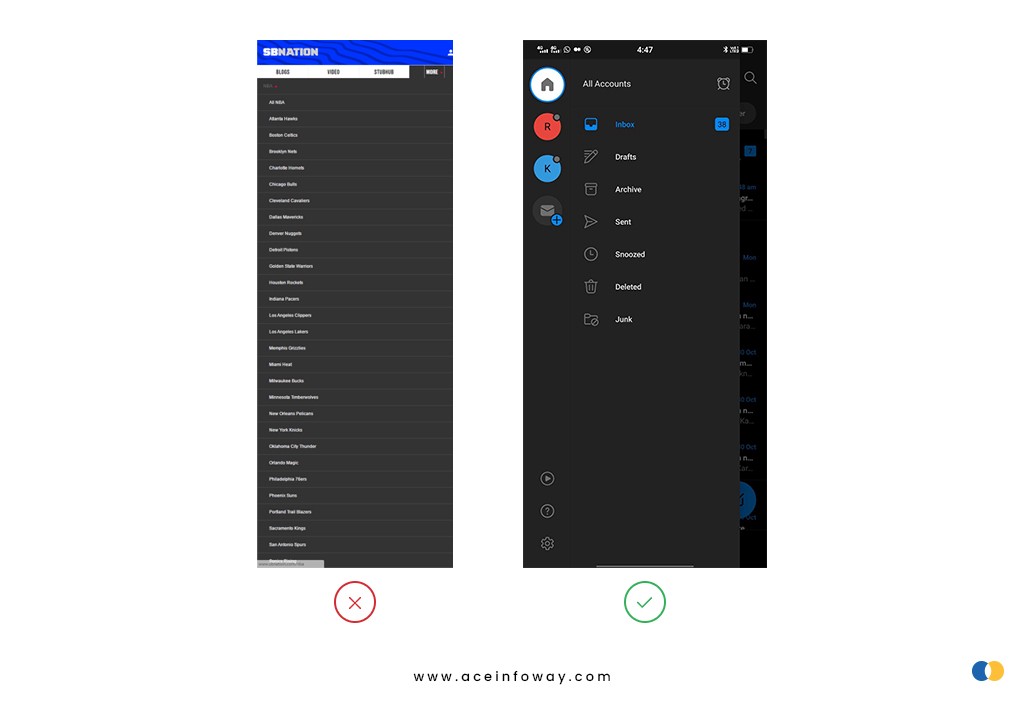
### 2) Hidden Navigation Menu Hidden navigation menu like a hamburger menu has hoover through navigation components in an app like a hurricane. No trend, though, is without its critics.
Out of sight, out of mind is the fundamental root of the problem with hidden menus. Users are less likely to tap on a menu when they can’t see it. Using a hidden navigation menu to discover what you want requires more cognitive work.
Users don’t use their mobile phones in a perfectly focused way, like a usability test. They often have several things on their minds at once, so if your navigation isn’t visible, then it might drive potential users away.
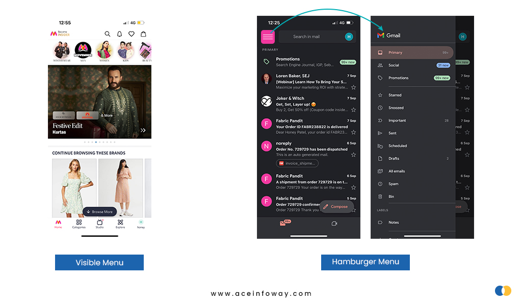
💡Practical Recommendation: Hamburger menus or hidden navigation menus are great for all secondary navigation menus. Therefore, the common advice is to use visible navigation, where the primary navigation choices are shown in a visible navigation bar, or combination navigation, where some of the primary navigation options are visible and others are concealed under an interactive element.
Explore other mistakes to avoid while developing your next mobile app: https://bit.ly/3zEEIzF

![10+ Hottest Web Design Trends to Inspire You in 2023 [Expert’s Opinion]](/_next/image?url=https%3A%2F%2Fcdn.hashnode.com%2Fres%2Fhashnode%2Fimage%2Fupload%2Fv1667026743384%2FAKmu5WSUZ.jpg&w=3840&q=75)
